Thursday, November 27, 2008

Project Track: Color testing sketches for color prediction II


                            Blue circle refer to selected color match

Project Track: Color testing sketches for color prediction I

                                                                           Color testing on stripes 


Blue circle refer to selected color match

Wednesday, November 26, 2008

Project Track: Summary report on color trend prediction for Sonia Rykiel Fall/Winter 09-10

Introduction

The project is divided into 2 phases, the 1st phase is a group research for a chosen brand, my group choosed Sonia Rykiel as the target brand. we did a lot of research based on several directions according to the importance of color usage of the brand: collections of the past 5-7 years, advertisements and publication, shops design and background history.

Phase 1--- Group research (collection)

We collected, analyzed and summarized the information and present them on our group web blog.
For each collection we found, we made single specific color palette and calculate the color scheme usage frequency, the color usage for each season apply different color formula, we analyzed the data and plotted charts of the correspondent color scheme for each single season.

So we could see the most frequently used color scheme is Achromatic with monochromatic scheme, followed by achromatic scheme, analogous and monochromatic scheme shared similar weight. We also concluded that there are 5 favorite hues for Sonia Rykiel, they are orange, yellow, green, purple and blue.

Phase 1--- Group research (advertisement)

In the group research phase, i was responsible for advertisement and publication. I analyzed the color usage of colors in the official website, which is basically used black in majority, and a gradual change of magenta to lilac as the highlight color.

I also studied magazine advertisement for women's wear, men's wear, children's wear, eyewear and cosmetics of several season.
I found that analyzing advertisement is different from analyzing collection, because the lighting backdrop color, make-up, hair color, skin color, even pupil colors are also part of the color scheme. Detailed analysis can be seen on the web for each advertisement.
I also discovered that the color useage in advertisement were sometimes collaborating with the outfits, when the focus are outfits, the background color are outstanding the outfits using complementary color scheme. When the accessories were focus, they would be in sharp colors, and the outfits colors become suppressed.
By doing the analysis of advertisement, I understood how color usage contribute to the brand image. Apart from colors used in collection, colors used in advertisement also played an important role on creating a mood of particular theme for each season, which eventually echo to the brand image.

I also understood how to control the color shown on advertisement, to enhance the purpose of selling products, or simply selling image. For example controlling the color matching, distribution, and proportion on a range of variables including lighting colors and direction, make-up, clothing, pops (background) and so on.

These date helped me to reinforce my understanding towards the brand image of Sonia Rykiel, which is pretty dynamic, you may found bold, young and sweet, romantic, or sometimes even with a little sporty on her models. Using these knowledge I could create a collection which fit to the brand's image.

They also helped me to develop a color scheme which is suitable for the brand’s Fall/ Winter 09-10 collection.


Phase 2--- Color prediction on Fall/Winter 09-10 collection
Color choice

I decided to make the collection cheerful, sweet and smart.

I applied soft, curvy silhouette and lines in the collection, and also details which emphasis ladyish for example draped collar and ruffled cuff.

For colors, I personally plot some graphs according to the color scheme usage trend in the Sonia’s collection for previous season. Finally I came out a decision that I will use approximately 50% achromatic scheme, 25% monochromatic scheme and 25% analogous scheme.

Therefore, within the 4 outfits, 2 of them will be achromatic in large proportion, 1 with analogous color match and one in monochromatic color.

Besides, I predict it will be less likely for the brand to repeat colors of near few seasons. Therefore, I did not choose colors similar to the colors used in Sonia’s previous collection.

I came out 8 core colors, half of them are achromatic, one is nude color (as I saw Sonia used nude colors in several season, I predict she will use if often), one is high chroma red, which personally I think it is cheerful and ladish color, one purple color close to magenta. Magenta is the hottest color for the brand. Plus a analogous color to match with the magenta-like color.

A detailed predict color palette can be seen on the web blog.

Phase 2--- Color prediction on Fall/Winter 09-10 collection
Color placement and proportion

I placed color according to the proportion of color scheme.

For outfits in achromatic scheme, I put cool colors in major garment part eg jacket and pant bodice, while matching warm colors in small details eg, collar, gussets.

For the outfit in monochromatic scheme, I used one color for both upper and bottom parts bodice, with a analogous color to do little color variation. I made this outfit in full color as it's upper to bottom proportion is 1 to 1, so it would look better not to mix different color for upper and bottom. I considered to use magenta instead of pale purple 7438c, but the high contrast of magenta and nude color 7514c made the garment look "bulk". Therefore i gave up magenta and used pale purple.

For the outfit with Achromatic and monochromatic scheme, i used red shoes to match because i think red color match with grey, honestly the focus was on the shoes as the red color was outstood by the grey.

For the outfits in analogous scheme, I planned the analogous color into stripes (derived from the signature rainbow stripes of Sonia Rykiel).I made some trials on the arrangement of the stripes colors in sketching stage.

For hair styling and shoes, I used white head-gear to balance the colors on outfits and I treated shoes into the color scheme as well.

The End

Tuesday, November 25, 2008

Project Track: Fall/Winter 09-10 collection for Sonia Rykiel


Sonia Rykiel Fall/Winter collection 09-10


I planned the collection using the predicted colors in the proportion i analyzed from the previous study. I will explain the color distribution Eg proportion, the placement in the report later.

Project Track: Predicted color palette for Sonia Rykiel Fall/Winter 09-10


Based on the color analysis of the brand's previous collection, plus the background and personal preference of the designer. I obtain a predict palette for Sonia Rykiel Fall/Winter collection 09-10.

There are 9 colors, with 50% achromatic color, 30% monochromatic colors and 20% analogous color.

The origin of the palette is based on the trend of the scheme which obtained from plotting the paths, using the information from the summary of the color scheme for the previous season.

I choosed color which is NOT used in the season near the current one. Because i predict the brand won't repeat colors in a short period of time, except it's signature color magenta.

Project Track: Color scheme analysis for Sonia Rykiel

Our team did a range of color analysis for Sonia Rykiel collection at the beginning stage of the project. Some season include both fall/winter and spring/summer collection. Some only have fall/winter collection.

We collect data from Style.com, and calculate the frequency of color scheme usage in her collection, we plotted the data into pie charts showing the percentage of color scheme usage.

You may found the highest frequency of color scheme is Monochromatic with achromatic scheme, followed by achromatic scheme.

A detailed and full analysis and summary of the color scheme can be found from the following links.

Continental colors on runway

The colors on National flag is seriously planned and considered. The colors and patterns are signature of the nation.

For example Britain. There are two national flags, they are developed from different history.
The White background red cross flag ( St. George's flag)  is developed based on the Cruciata 1096-1291, the red cross is a religious symbol, the soldiers eventually had a great success and later on their symbol was used in the national flag.

Another one is a from a combination of St. Andrew's flag ( blue background white X) and St. Patricks's  flag ( white background red X) of Scotland. In that period, Britain is ruled by Scotland King.

The final mixture of the three Scotland flags formed the Britain national flag and be used until now.

The nobel blue, red and white become signature color for Britain. And also the tartan pattern and color which is the traditional costume of Scotland. Some  fashion designers often use these colors in the collection. One example is Rei Kawakubo, she used England flag as the inspiration in her Spring/Summer 06 collection. Lots of England flag is found. Besides, she welly choose and apply colors in the Scotland tartan pattern. 


There are at least 3 pattern and more than 5 color combination within the pattern for each set of clothing.
For some sets, she matched pure color top with monochromatic pattern bottom. For some she matched 2 checked pattern in Analogous color ( Eg Blue tone check and Green tone Check) or in Traid color ( Yellow tone check top with blue tone check bottom and red check belt).

Although the color combination are crashing each other in the color hue, but she made them harmony on the runway as she cleverly and carefully control the intensity and value of the colors.


The collection completely show the wonderful and subtle color usage skill of Rei Kawakubo.


Satellite Color on runway


How to describe the colors on the solar panel of the satellite?
The transform of the "electric" colors is wonderful, there is no edge, no boarder between each colo
rs, all the colors are merge into each other to become one color.
The colors not only about hues, intensity, or value. They all rely on light also, lighting has an important effect on the change of colors.

Lets s
ee what satellite colors are


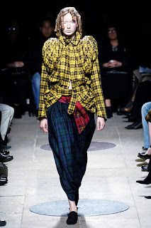
Fashion label Balenciaga is using satellite as the inspiration of the spring/summer 09 collection, the show is marvelous , from the clothing to lighting. Satellite colors are thoroughly applied into the fabric ( Lurex brings shine to the fabric surface), and also the accessories, the make up and hair color of the model. Finally the lighting on the stage.

These all combination of effects make the models look like satellite.


Class exercise 3


In this exercise, i choosed only 3 colors, (actually 2 excluding white) for the interior color design.
I choosed high chroma red wine color and high value dark wooden brown, and also white.
I think white and high chroma red wine color is very contemporary, while dark wooden brown is classic, this combination of color create a cutting edge and classic contrast for the image of the store.

I just think White tiger skin is sooooooo coooollllll!!!!